Shipster
Ship with style and purpose

PROJECT GOALS
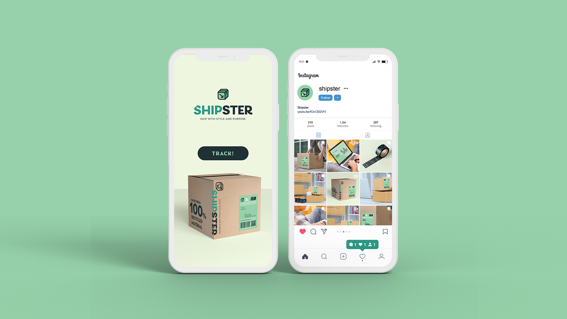
As the need for online shopping has grown dramatically since the pandemic, I thought of creating a fictitious shipping company that gives a stylish and swell shipping experience with environmental issues in mind. Shipster specializes in an eco-friendly packaging system to reduce waste and emphasizes the convenience of practicing a non-contact lifestyle with unattended package drop-off without visiting the actual branch store.
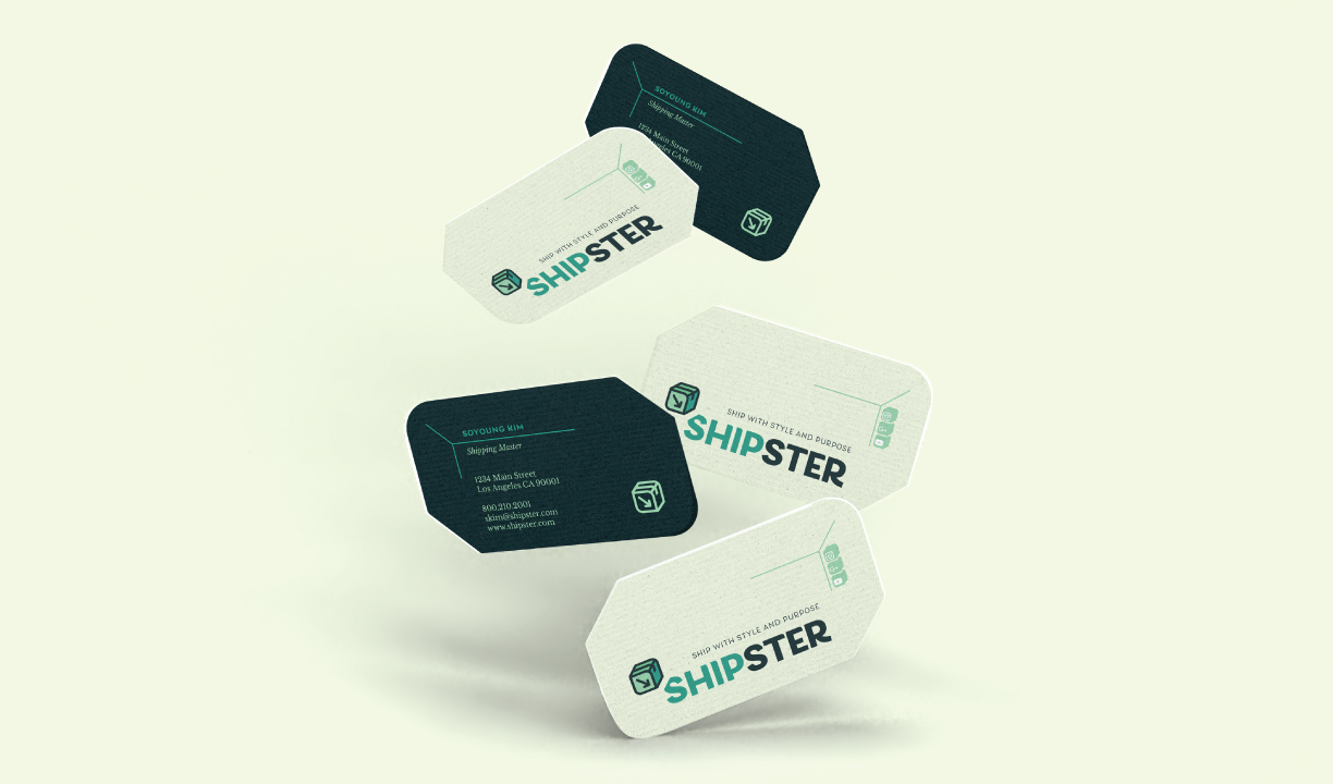
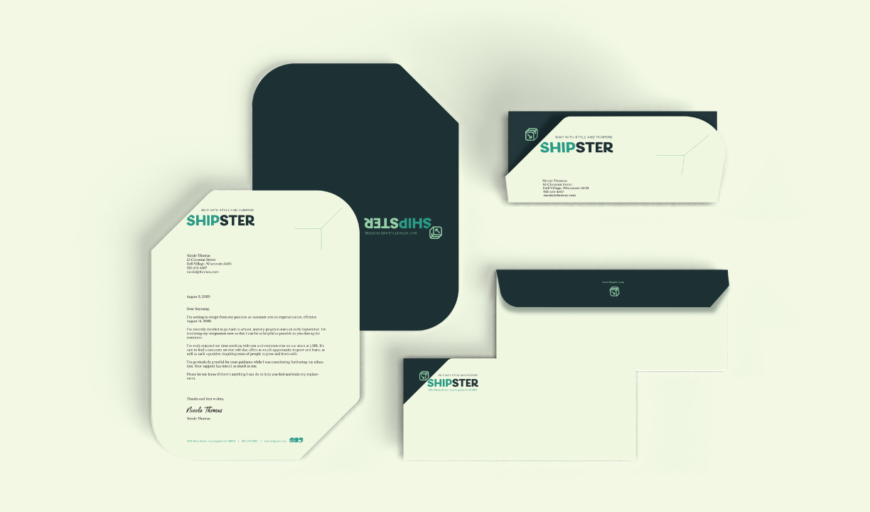
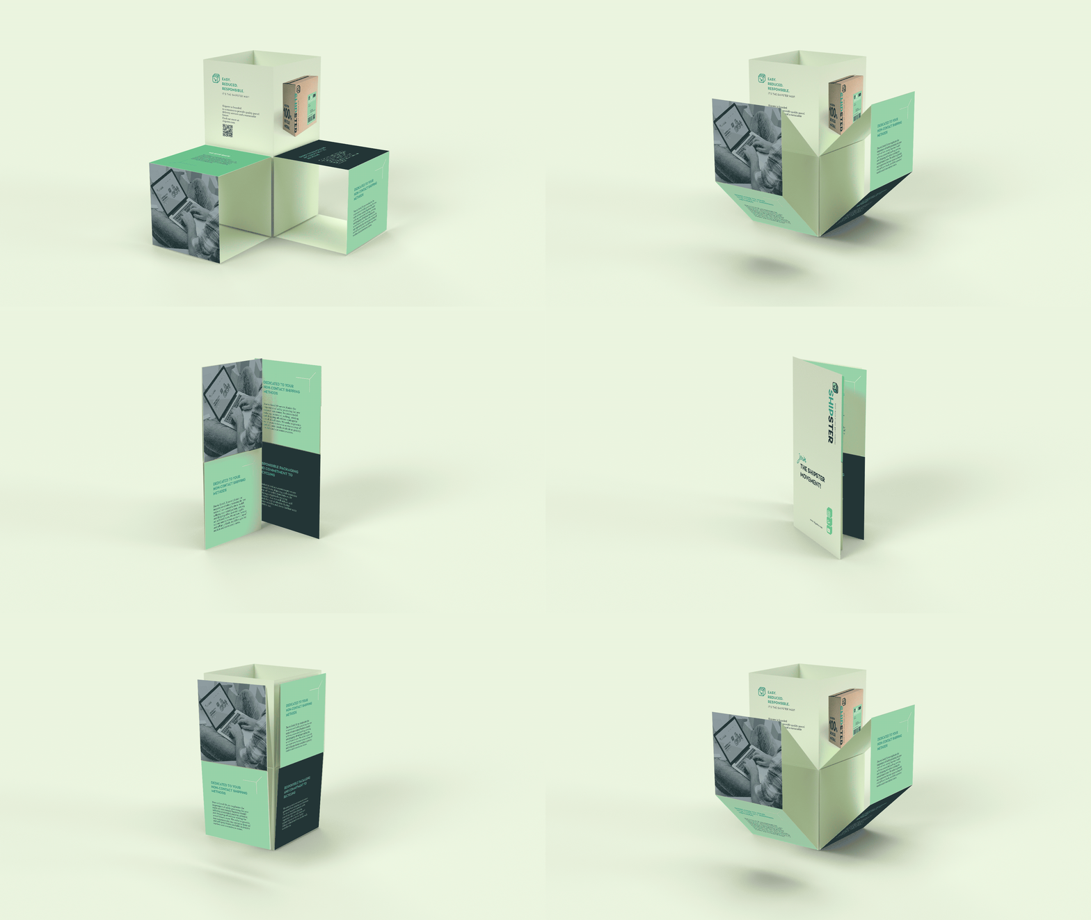
The challenge was to visualize a hip and contemporary brand that conveys the company's business ethic. The branding includes the naming of organizations, creating brand assets, designing business paper and package systems, and solving environmental issues.

TARGET AUDIENCE
It is targeted for people who want to get a simple, convenient, and eco-friendly shipping method. They feel comfortable using the internet and mobile devices for self-printing and dropping off packages. Open liberals tend to value environmental awareness. They are willing to pay more for sustainable services and typically prefer quality experience over cheap value and reusing over owning. They are attracted to visual images and trendy design and style.

BRAND DRIVERS
Stylish
Reduced
Effortless
Practical
Sustainable
Shipster
"The most important thing to me is experience over products."
LOGO DEVELOPMENT PROCESS
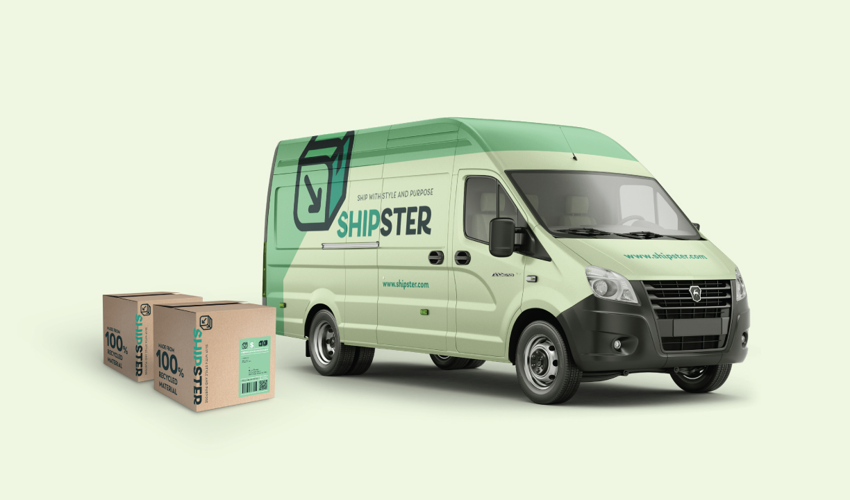
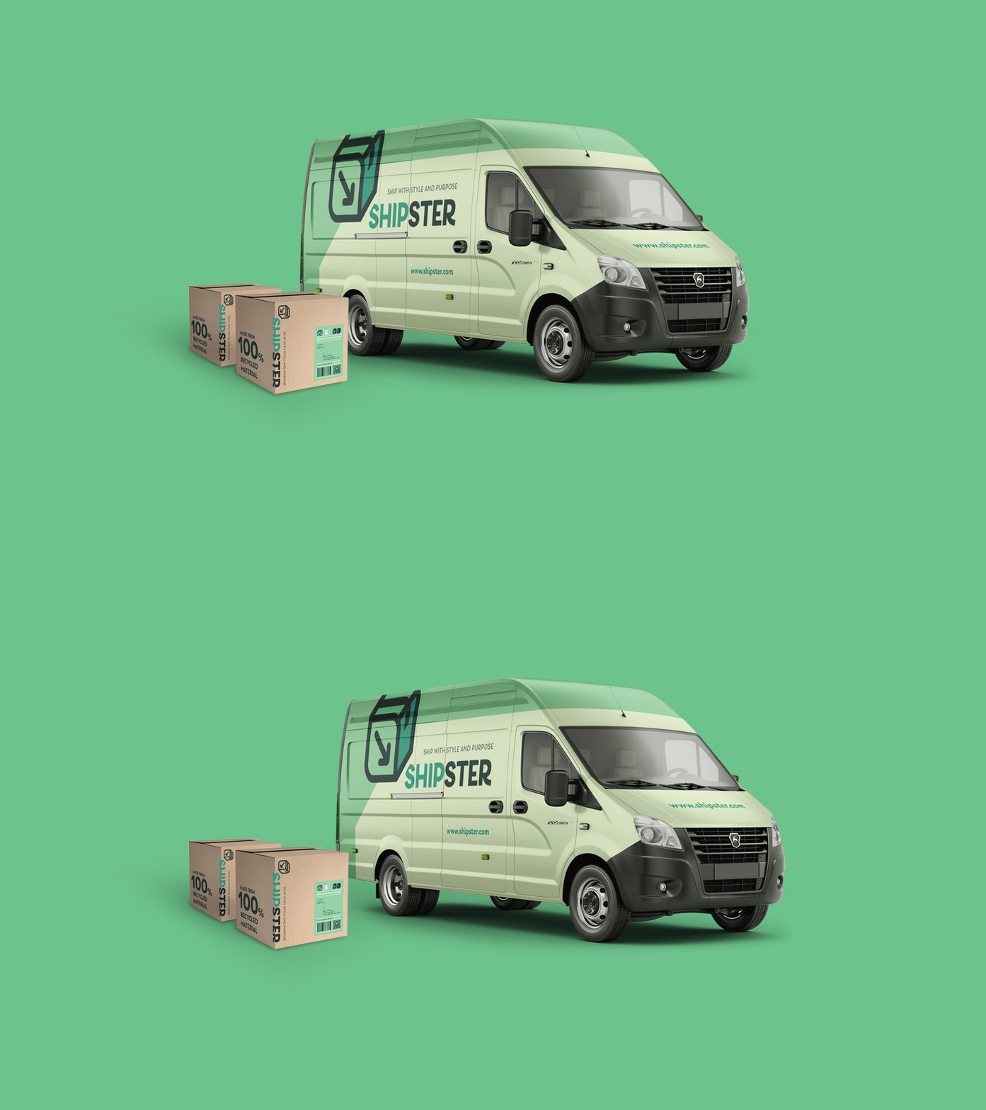
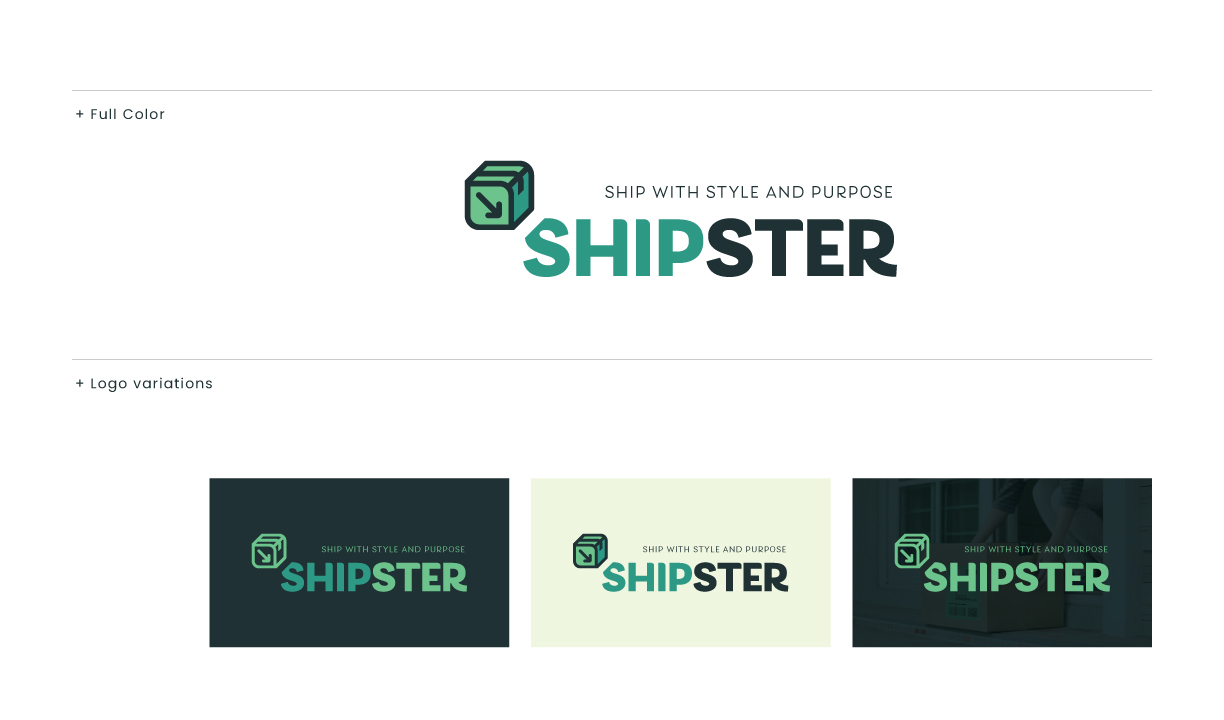
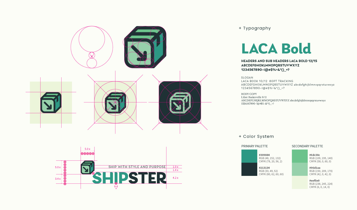
The brand identity of Shipster is to visualize the company’s function and business motto in one symbol while giving a corporate look. The retro green color combination is chosen to bring natural yet hip tones, and the lively typeface brings character and personality.
 Shipping box with tape secured +
 A leaf symbolizing a sustainable business model +
 An arrow symbolizing movement (pick-ups + drop-offs) =
 Combined with a rounded bold sans-serif typeface for a modern and clean look
BRAND APPLICATION
